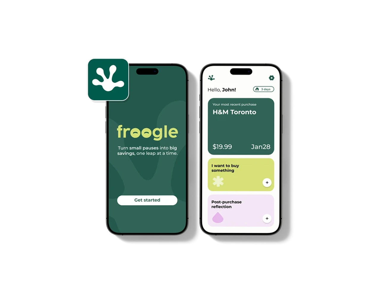
00 — Summary
-
01 The problem
Budgeting apps demand too much upkeep, so neurodiverse users (especially with ADHD) avoid them.
-
02 The solution
Two quick reflection moments: a pause before buying and a light check-in after, with no budgets or charts.
-
03 Key decision
We cut budgeting entirely so Froogle could do one thing well, built in a ~5-hour hackathon.
01 — Overview
The challenge
We started with a hackathon prompt:
“How might we design a personal finance app that helps neurodiverse individuals reach their financial goals?”
We explored spending behaviour, impulse purchasing, and ADHD-related financial challenges.
02 — The Insight
What the research told us
01
What influences impulse buying
Impulse buying can be influenced by emotions, self-control, social norms, personal motives, and marketing stimuli.
Iyer et al., 202002
ADHD & immediate gratification
Research involving adults with ADHD found a greater tendency toward impulsive buying and choosing immediate gratification over delayed rewards.
Einarsson et al., 2024Our research pointed to one recurring opportunity: helping users slow down in the moment of a purchase.
03 — The Pivot
Key decision: cut the budgeting, keep the pause
We wanted a simple, approachable experience that wouldn't overwhelm users with complex budgeting features or too much financial information. We explored a wide range of ideas through rough sketches, including budgeting, spending tracking, goals, and reflection features.

As we moved into Figma, our early concepts still leaned heavily toward budgeting. The more features we added, the more the experience started to feel like a traditional finance app.
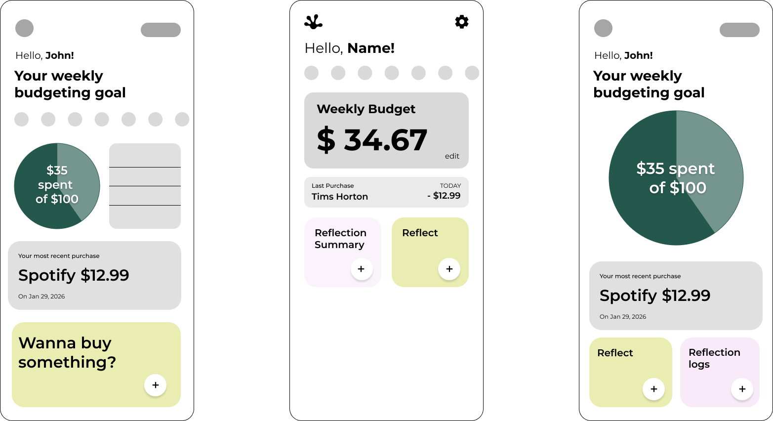
Before
Budgeting-first
- Weekly budget goals to set and maintain
- Pie charts and running spending totals
- Numbers to check, log, and keep up with
- Felt like every other finance app
After
Two reflection loops
- A quick pause before a purchase
- A light check-in after a purchase
- No graphs or budgets to manage
- Friction exactly where impulse buying happens
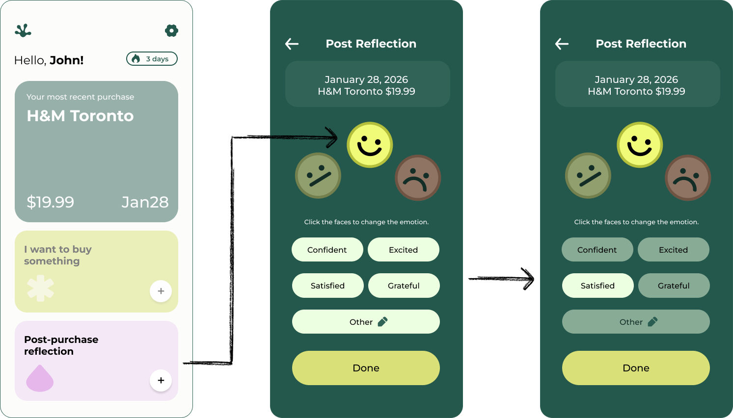
That helped us make a key decision: remove the budgeting features and focus Froogle on its most distinct behaviour: helping users pause before a purchase and reflect afterward.
04 — The Solution
Two simple reflection loops
The final experience uses two simple reflection loops: one before a purchase and one after.
Pre-purchase reflection
A quick series of questions helps users pause and consider whether the purchase aligns with their needs.

- Start
- Category
- Need or want?
- Already own it?
- Suggestion
Post-purchase reflection
After a purchase, users can reflect on how they feel about it, helping them recognize patterns over time.

05 — Reflection
What I'd carry forward
Removing features can be the feature. Froogle got clearer the moment we cut budgeting, and adding a little friction right at the moment of decision mattered more than tracking spending afterward. With only a few hours, committing early to the core feature let us go deep instead of shallow.